The Elias | Logo Design
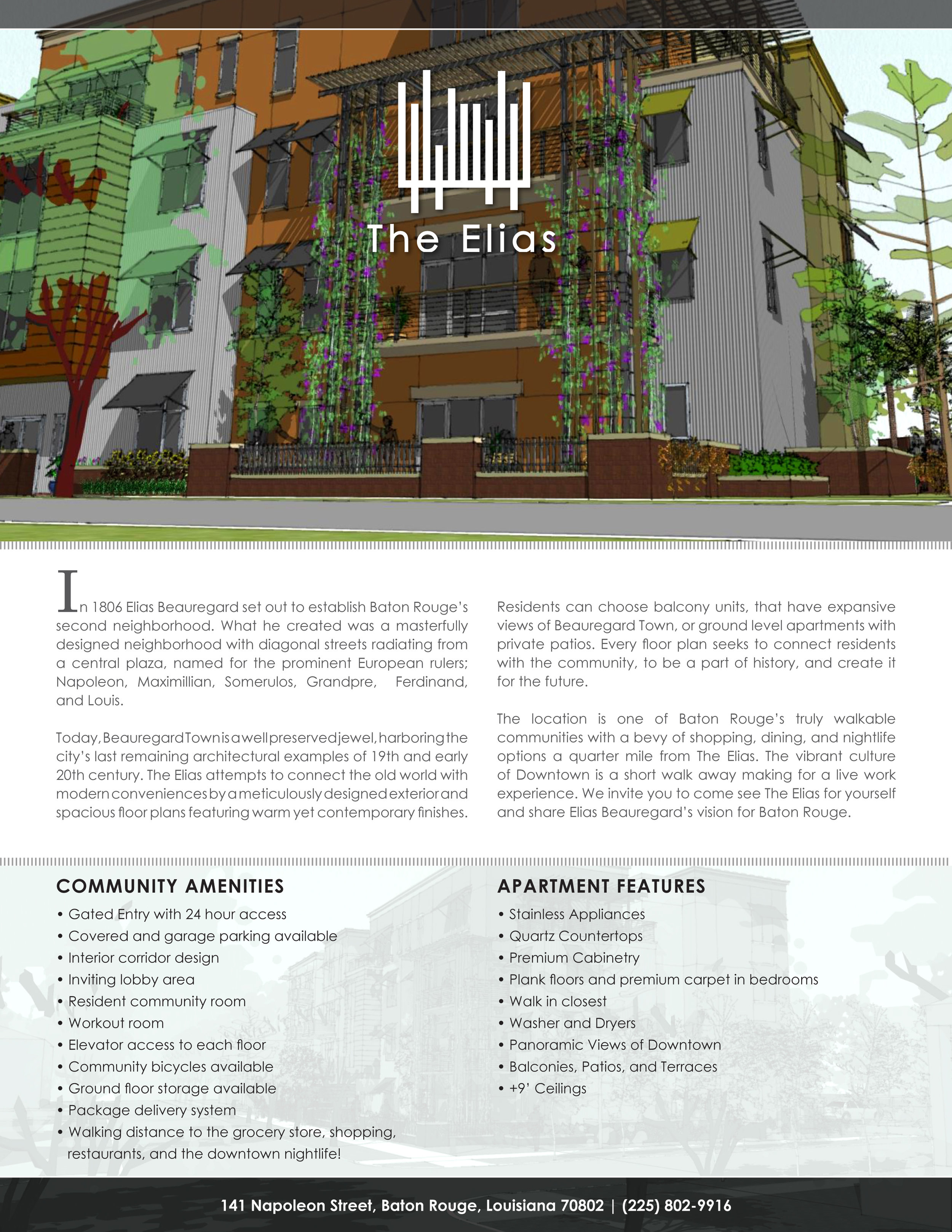
The Elias is a multifamily property in Baton Rouge, LA. which was still under construction when I worked on this project. My role on this project was to create the overall brand strategy, design all marketing collateral and create the exterior signage for the building.
The property is in a historic downtown district which offers luxurious upscale living. The unit features are trendy and modern and the community amenities are first class. The demographics are young adults who are looking to reduce their commute and live in a community that offers a lavish lifestyle with retail and entertainment a short walk away.
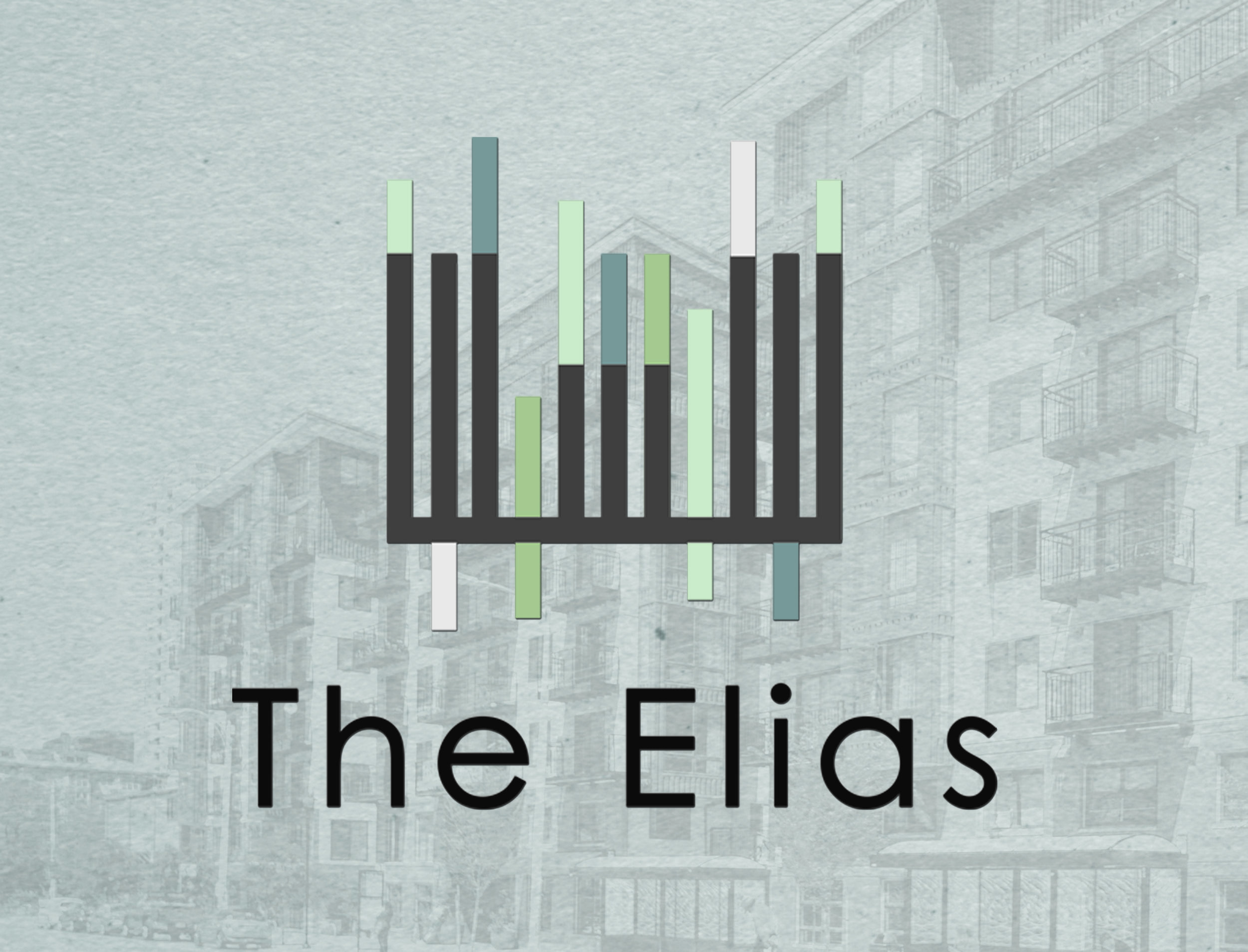
My goal was to communicate this tone throughout the brand materials. I wanted to highlight the letter “E” and incorporate the downtown feel into the logo mark. The typeface solution needed to be modern and simple so that it would not overpower the logo mark. Picking the color scheme was the easiest part. I knew I wanted to use grey and felt like the supporting colors needed to be subtle, yet able to stand alone.
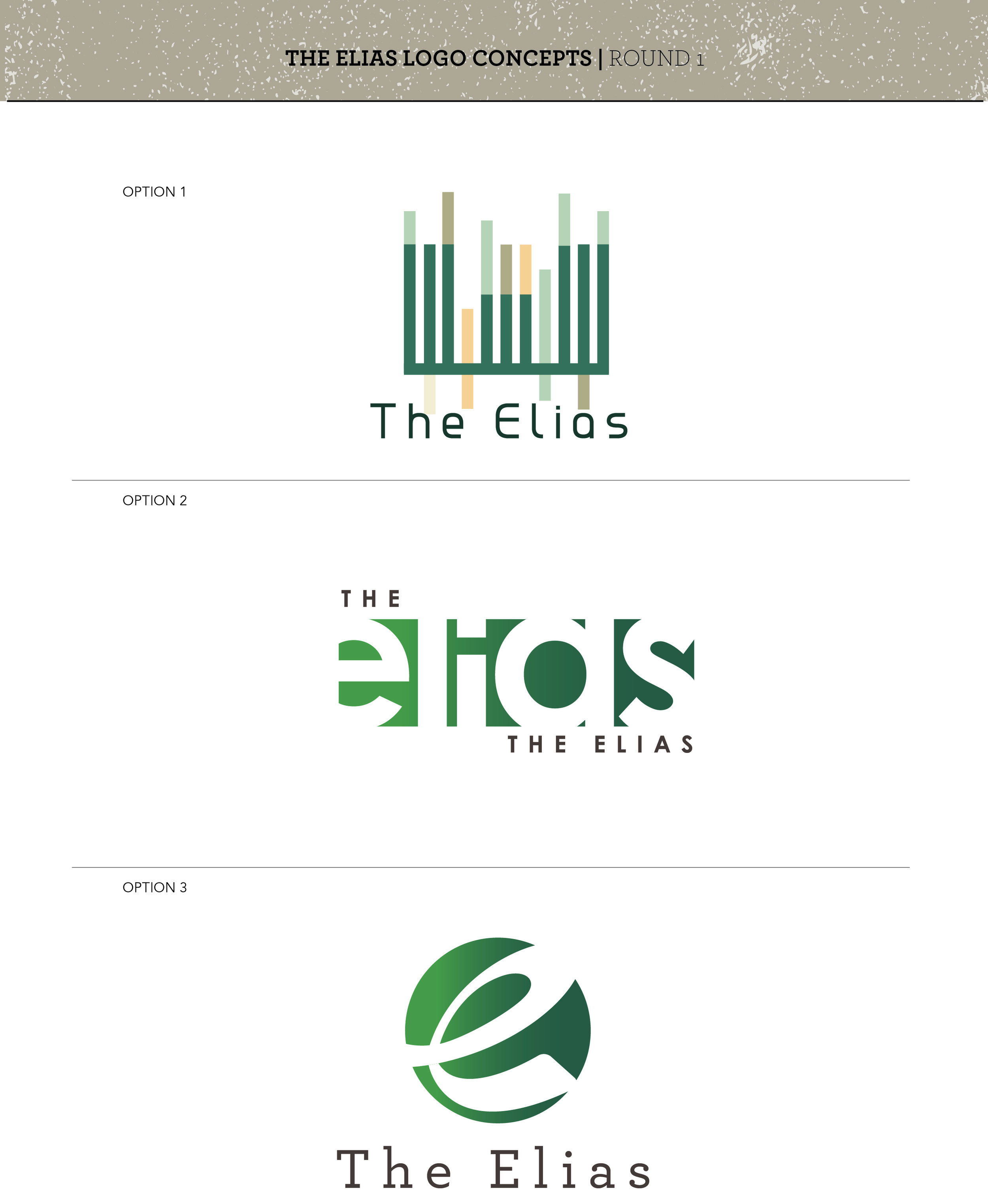
I rotated the letter “E” on its side and added multiple rectangle boxes that act as an extension of the “E”. This design element was meant to add color, resemble a downtown building and add a modern touch to the brand mark. Beneath the final Brandmark are a few ideas which resulted in the final solution.

Final Logo

Logo Concepts

Flyer
